Security News
Python Overtakes JavaScript as Top Programming Language on GitHub
Python becomes GitHub's top language in 2024, driven by AI and data science projects, while AI-powered security tools are gaining adoption.
@react-aria/select
Advanced tools
@react-aria/select is a React library that provides accessible components for building custom select menus. It is part of the React Aria collection, which focuses on providing high-quality, accessible UI components.
Basic Select
This code demonstrates a basic select component using @react-aria/select. It includes a label, a button to trigger the select menu, and a list of items to choose from.
import { useSelectState } from '@react-stately/select';
import { useSelect } from '@react-aria/select';
import { Item } from '@react-stately/collections';
function SelectExample() {
let state = useSelectState({
items: [
{ key: 'red', name: 'Red' },
{ key: 'green', name: 'Green' },
{ key: 'blue', name: 'Blue' }
]
});
let ref = React.useRef();
let { labelProps, triggerProps, valueProps, menuProps } = useSelect({
label: 'Favorite Color',
items: state.collection,
selectedKey: state.selectedKey,
onSelectionChange: state.setSelectedKey
}, state, ref);
return (
<div>
<label {...labelProps}>Favorite Color</label>
<button {...triggerProps} ref={ref}>
<span {...valueProps}>{state.selectedItem ? state.selectedItem.name : 'Select an option'}</span>
</button>
{state.isOpen && (
<ul {...menuProps}>
{[...state.collection].map(item => (
<Item key={item.key}>{item.name}</Item>
))}
</ul>
)}
</div>
);
}Custom Styling
This example shows how to apply custom styling to the select component using CSS classes. The custom styles are defined in an external CSS file.
import { useSelectState } from '@react-stately/select';
import { useSelect } from '@react-aria/select';
import { Item } from '@react-stately/collections';
import './customStyles.css';

function CustomStyledSelect() {
  let state = useSelectState({
    items: [
      { key: 'apple', name: 'Apple' },
      { key: 'banana', name: 'Banana' },
      { key: 'cherry', name: 'Cherry' }
    ]
  });

  let ref = React.useRef();
  let { labelProps, triggerProps, valueProps, menuProps } = useSelect({
    label: 'Favorite Fruit',
    items: state.collection,
    selectedKey: state.selectedKey,
    onSelectionChange: state.setSelectedKey
  }, state, ref);

  return (
    <div className="custom-select">
      <label {...labelProps}>Favorite Fruit</label>
      <button {...triggerProps} ref={ref} className="custom-trigger">
        <span {...valueProps}>{state.selectedItem ? state.selectedItem.name : 'Select an option'}</span>
      </button>
      {state.isOpen && (
        <ul {...menuProps} className="custom-menu">
          {[...state.collection].map(item => (
            <Item key={item.key} className="custom-item">{item.name}</Item>
          ))}
        </ul>
      )}
    </div>
  );
}react-select is a flexible and customizable select input control for React. It provides a wide range of features including multi-select, async options, and custom styling. Compared to @react-aria/select, react-select offers more out-of-the-box customization options but may require additional work to ensure full accessibility.
downshift is a library that provides primitives to build accessible, flexible, and customizable dropdowns and comboboxes. It offers a lower-level API compared to @react-aria/select, giving developers more control over the behavior and appearance of their components. However, this also means more effort is needed to implement common patterns.
react-autosuggest is a library for building accessible and customizable autocomplete components in React. It focuses on providing a great user experience for search and suggestion inputs. While it is not a direct replacement for select components, it can be used for similar use cases where suggestions and selections are needed.
This package is part of react-spectrum. See the repo for more details.
FAQs
Spectrum UI components in React
We found that @react-aria/select demonstrated a healthy version release cadence and project activity because the last version was released less than a year ago. It has 2 open source maintainers collaborating on the project.
Did you know?

Socket for GitHub automatically highlights issues in each pull request and monitors the health of all your open source dependencies. Discover the contents of your packages and block harmful activity before you install or update your dependencies.

Security News
Python becomes GitHub's top language in 2024, driven by AI and data science projects, while AI-powered security tools are gaining adoption.

Security News
Dutch National Police and FBI dismantle Redline and Meta infostealer malware-as-a-service operations in Operation Magnus, seizing servers and source code.

Research
Security News
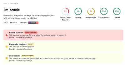
Socket is tracking a new trend where malicious actors are now exploiting the popularity of LLM research to spread malware through seemingly useful open source packages.